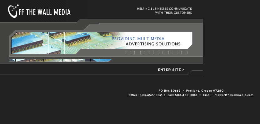
There are a few elements that could make your website scream “year of 2002” and could turn off potential customers. Most customers will spend less than 15 seconds on the home page before clicking away, which gives you only 15 seconds to capture their attention.
Outdated and unattractive websites can turn away customers before they get to know anything about your company. Many businesses have a hard time justifying spending thousands of dollars on an updated website, but in reality it may be one of the most important tools to help gain new customers and ultimately make more money. Below are some outdated trends that your website needs to abandon right away.
Non-mobile-friendly- With over half of local searches being done on a mobile device, your business is losing out on many potential customers if you don’t have a mobile-friendly website. If that isn’t a good enough reason then you may have also want to know that Google is penalizing non-mobile-friendly websites by placing them lower on search results. Now is the time to embrace mobile if you haven’t already.
Too much design clutter and text- Cluttered, over-designed websites crammed full of graphics and text will send visitors away fast. With the 15 second time limit you have to capture their attention, if they see way too much going on and can’t figure out what your brand is about, they will bounce. Simple design is hot since it is a more efficient way to communicate what your company and brand represents and what you can do for your customers.
Outdated design elements and fonts- When your website has font styles that were trendy 10+ years ago, it can make your business seem out-of-date to visitors. Design elements like bevel and embossed titles can give the message that your business has some catching up to do. If you have old style clip-art type images on your site, please step into the current decade and get rid of those now.
Flash intro- Flash intros were so 2006. In 2015, flash can be a huge issue for your visitors because it may not be compatible with their mobile device, it can cause the page to load more slowly and can be frustrating for users who just want to get more information. If the intro offers no real value to your visitors, than it may be time to work on a new homepage. Flash intros take away from valuable above-the-fold space where you could be capturing visitors attention right away with your brand message.
Cheesy stock images- Images are one of the most important aspects of engaging your viewers but if you use the wrong ones, it can also hurt your business. Stock photos are a cheap way to get high quality images, but it is important to choose them wisely. Cheesy, obviously-fake stock photos on your websites homepage can decrease the credibility of your business. Bad stock photos can leave negative feelings about your brand to visitors. Give your viewers a better website experience by using genuine images that promote your brand in a positive light.
Does your website have any of these outdated trends? Give your business a modern look online with the web experts at Off The Wall Media. Call 503-452-1082 to get started today!

