One the most powerful pieces of the digital world got a whole lot more simple in 2015. This year, web design transformed from information overload to focusing on empty space and simplicity. Websites are now using more high-definition photos and unique typography to capture readers with eye-pleasing content. With a shift in web design trends over the past 11 months, here are the top 7 trends we saw in 2015.
1. Minimalism. Many aspects of web pages took a the minimalistic approach by simplifying logos, typefaces and color palettes while de-cluttering footers and navigation. Sidebars and borders are becoming obsolete as companies emphasize simple visual design.
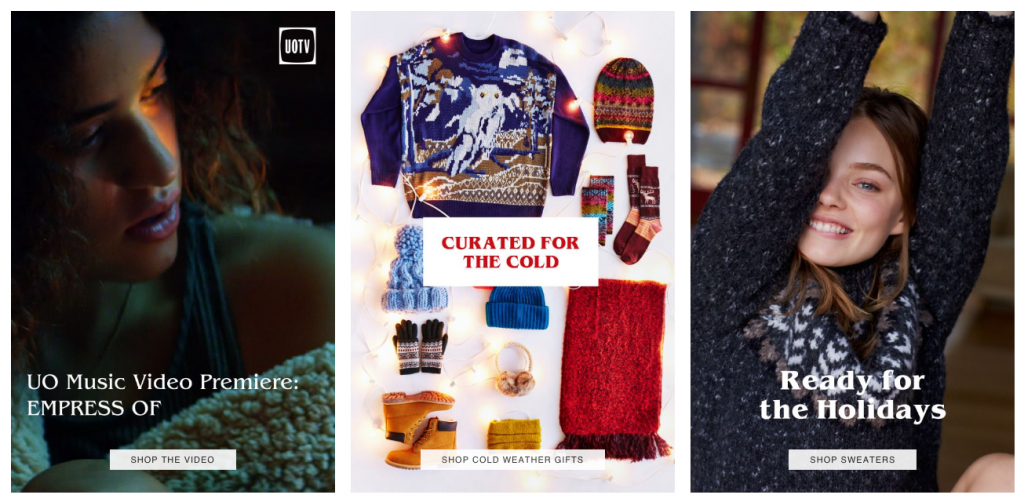
2. Ghost buttons. Instead of having big bright colored buttons, websites are embracing transparent or “ghost” buttons. Ghost buttons allow for visitors to read more content instead of being forced to click on flashy call-to-action buttons.
3. Single page design. Scrolling is the new clicking. This year we saw an even larger shift to single page websites where users scroll through content on one long page. The single page design translates extremely well to mobile web design, since it is much easier to scroll with your thumb than to click through multiple pages and wait for each one to load.
4. Modular design. Grids, tiles or cards are a few of the latest trends for organizing content in an eye-pleasing design. Modular design allows for more content to show on a page and is faster for users to view various topics.
5. Flat design. Last year, flat design made a huge impact on the web. Websites are using simple illustrations and minimalistic two-dimensional content that are incorporated in flat design.
6. Line icons. To complement flat design, simple line icons are becoming universal in web design. Line icons are used instead of text on web pages that add to the simplistic design approach. Some examples are a magnifying glass that symbolizes a search function or the three stacked lines that represent the menu.
7. Unique typography. Engaging fonts are critical to luring readers eyes to website content. Unique and interesting typography helps share powerful statements without other distractions.
In 2016 we predict that these trends will continue to stay current for modern web design. If your business hasn’t adopted the trends of 2015 yet, it may be time to consider a website re-design. The web experts at Off The Wall Media are here to help your business reach your online goals for 2016. Call 503-452-1082 or visit our website to get started.

